
Getting Started
Apply Theme
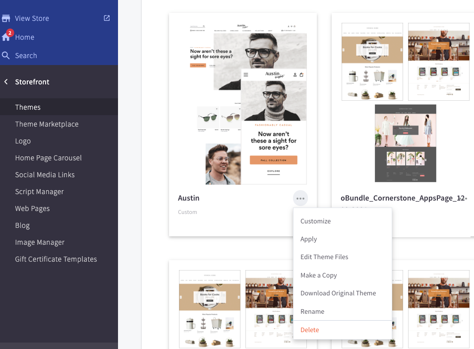
From the store admin panel, navigate to Storefront > My Themes and find the Austin template. Click on the 3 dots next to the template name and select the Apply option from the drop-down that appears. Select whichever child theme you would like to use for your store.
Theme Editor
Once an Austin template has been applied, you can navigate to the theme editor to begin the majority of your customizations. Under the Current Theme heading, there should be a blue Customize button to the right of the main Austin image. Click this to launch the theme editor.

Widget App
- The Austin theme comes with built-in components for the homepage.
- To use our custom widgets, you'll need to hide some of the default components in the theme settings.
- Go to Storefront > Themes > Austin > Customize
- In the theme editor under "Theme Styles", find the "Homepage" section
- Look for options like "Show Testimonial Carousel", "Show Featured Products", "Show CTA 1", etc.
- Uncheck the boxes for the components you want to replace with our widgets
- Save your changes in the theme editor
- After hiding the default components, click the "Install Widgets" button below to add our custom widgets to your store.
- Once installed, you can customize the widgets' content in your BigCommerce store's admin panel.
- If you want to remove all installed widgets, click the "Delete Widgets" button.
Customize!
Recommended Image Sizes : Regardless of the images you use, the theme will do its best to make any image work where you place it. However, if the dimensions differ from what is recommended, there is no guarantee that it will not look grainy or distorted.
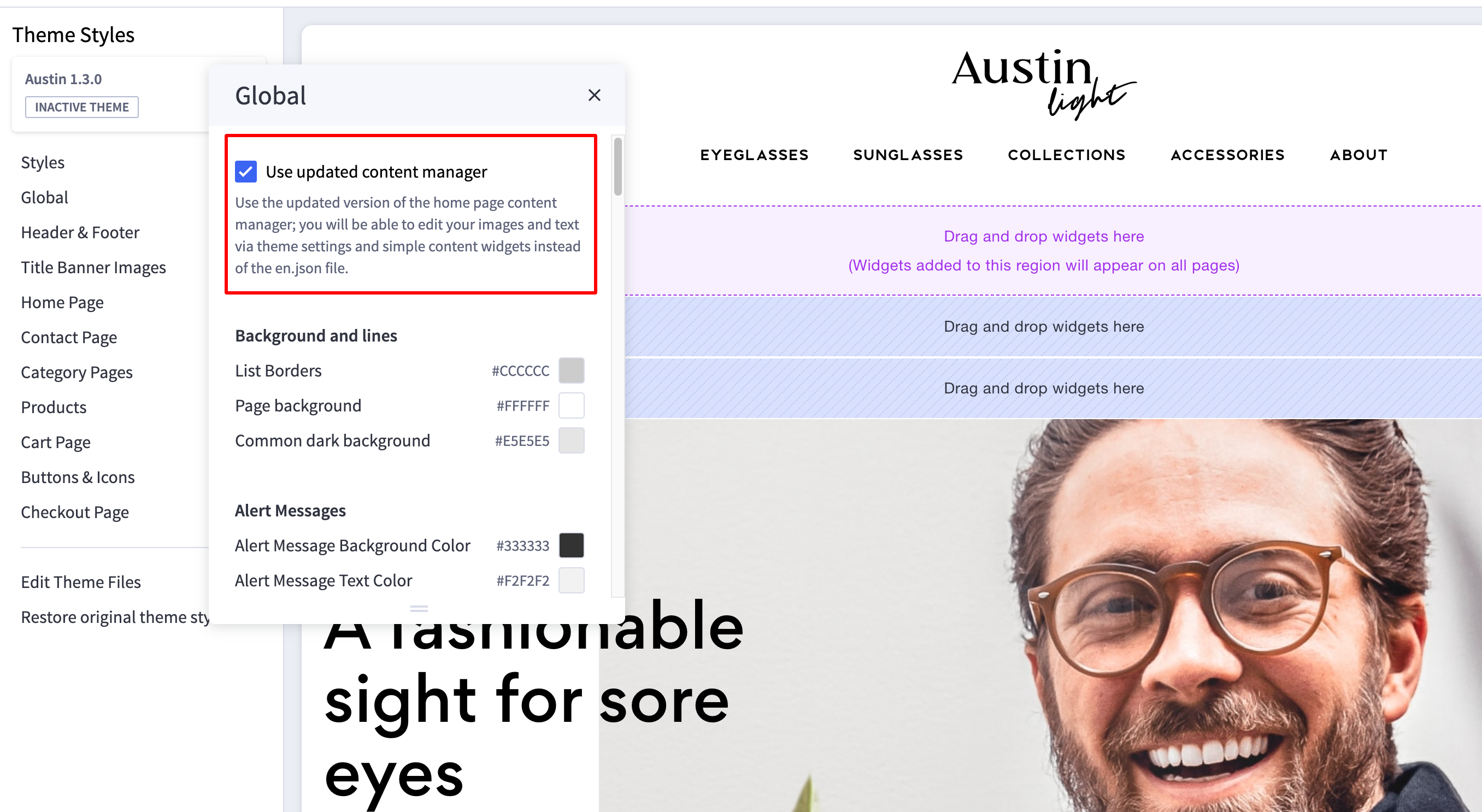
Content Manager
As of Austin v1.3.0, all primary content for the home pages has been moved from the en.json file to Theme Settings and default text widget placement. If for any reason, you need to revert your theme back to using the values in the en.json file, you can do so by changing this setting here:
Theme Colors
After launching the Theme Editor, click on the 'Theme Styles' icon (the one shaped like a painter’s palette) to open the theme settings. In the 'Global' settings, you will find basic color options, some display options for page headings, and other fundamental options for your store.

Austin Night
The 'Night' variant allows you to toggle a background image for the mega menu dropdown, the footer, and the homepage Newsletter signup banner.

Austin Vogue
Note that the 'Vogue' variant uses a unique pair of settings to determine the background colors of certain elements: the homepage’s Newsletter signup banner and testimonials carousel, and primary action buttons.

Header & Footer
Header
The options for the theme header included in Austin consist of the container background, Logo, Navigation colors, and the ability to display certain promotional links and messages.
Promo Message & Blog Navigation
The promo message (default “Orders over $50 Ship Free!”) and the Gift Certificate / Blog Navigation can be toggled on and off in the theme settings. If the BC blog is not active, the Blog link will not show. Additionally, you can edit the promo message text by changing the appropriate field in the theme editor.

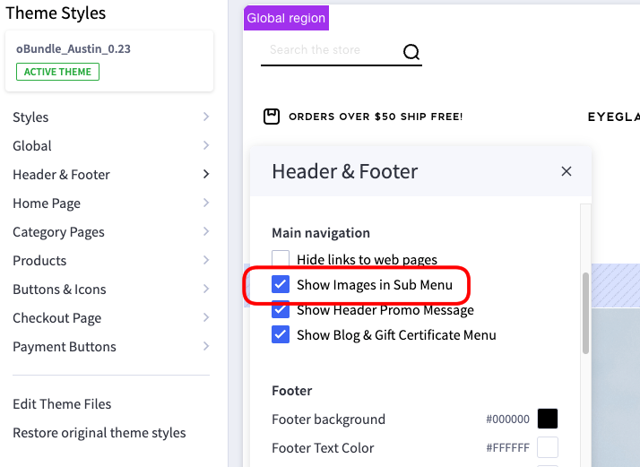
Mega Menu Images
The 'Show Images in Sub Menu' checkbox allows you to toggle the main category image on and off in the navigation drop-down. This image refers to whatever image you upload to the Edit Category page in the admin panel.

Recommended Image Size: 500x350 pixels.
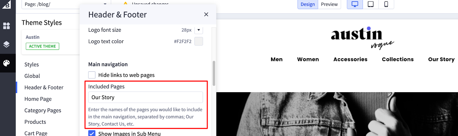
Content Pages in Menu
In order for a content page’s link to appear in the main navigation, it must be made visible in the store’s Control Panel, as well as listed in the 'Included Pages' input in the theme settings. If you want to show multiple page links, separate the list with a comma and a space: About, Privacy Policy, etc.

Footer
The store’s footer, located at the very bottom of the site, can be customized in a small variety of ways. This includes the container background, text and link colors, the alternate Logo and store location/operating hours, and the urls and text for the links that appear in the custom 'Support' navigation column.
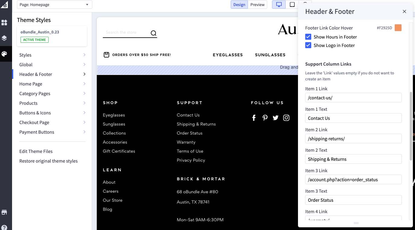
The various column visibility can be toggled on and off, as can the address and the store’s operating hours. The hours can be edited in the appropriate field in the theme settings. The address information is pulled from the ‘Store Profile’ in the general admin panel.
Home Page
Carousel
The main image carousel uses the built-in 'Home Page Carousel' options for its content. From there, you can upload the background images, edit the primary lines of text, button text, and button link. The options in the theme editor let you determine whether or not to have the carousel, toggling the navigation arrows on and off, and various colors.
Recommended Image Size: 1390x840 pixels.


Product Lists
There are two product lists that populate on the home page by default: New Products and Featured Products. You can toggle the appearance of these lists on and off, as well as set how many products can appear in each section.

Custom Content Rows
These custom content rows are another optional feature for your site’s home page. From the Theme Editor, you can choose to show or hide each individual row, as well as set any relevant colors.
You can swap out image names from your store's Image Manager, and edit text areas by utilizing the Page Builder's default Text widget. Fonts will automatically be styled to match the theme.
Newsletter Signup Banner


Testimonial Carousel


Image + Text 1


Recommended Image Sizes: (Tall) 540x810 pixels; (Short) 495x290 pixels.
Image + Text 2


Recommended Image Sizes: (Tall) 540x810 pixels; (Short) 540x580 pixels.
Image + Text 3


Recommended Image Sizes: (Icon) 55x55 pixels; (Tall) 540x810 pixels.
Promo Hero Banner


Recommended Image Size: 970x540 pixels.
You may notice that, when dropping in these text widgets, there will be some padding that shifts the text out of alignment slightly. You can get rid of this by clocking on the parent 'Column' field around your widget and setting the default padding to 0:

Blog Feed

Category Pages
Show Subcategory List on Sidebar
This setting in the category page allows you to choose whether or not you have a secondary list of your shop categories included in the top of the left column for easier navigation.

Category Title Banners
To set the background image for a category title banner, upload the image you would like to use in your store’s Image Manager (must be a .jpg file), and name the image file as follows:
category-banner-{{category ID}}.jpg

To find the Category ID, go to Products > Product Categories > click on the category in question. You should be able to see the ID in the URL bar, at the end of the string.

Brand Title Banners
Similar to the category banner images, brand images are fetched from your store’s image manager. Upload the image you would like to use in your store’s Image Manager (must be a .jpg file), and name the image file as follows: {{brand-name}}.jpg . For example, if your brand is named ‘Austin Light’, your image file would be ‘austin-light.jpg’.

Recommended Image Size: 1560x350 pixels.
Products
Play Video
The 'Play Video' button does not require any special attention to function. As long as there is a product video uploaded, this will automatically appear.

Short Meta Description
The brief pseudo-description of a product (located just below the product name) can be set by editing the individual product’s 'Meta Description' field:


Details
The Details section is populated using the general 'Product Description' text editor.

Warranty
The Warranty section is populated using the 'Warranty Information' field in the product editor.

Downloads
This product content section appears if there are specific custom fields set with values containing links to download files. The 'Custom Field Name' must be called 'Download'. The formatting for the 'Custom Field Value' is as follows: [[Text you want to appear as the download link]]

Content Pages
Unique Title Banners
There are a small handful of unique title banners across the Austin theme. They are at the top of the blog index and entries, on the main brands listing page, the custom About Us template, and the default Contact Us template. They can all be swapped out by uploading a custom image via your store's image manager, and then changing the file name in the appropriate theme field:


Recommended Image Size: 1150x350 pixels.
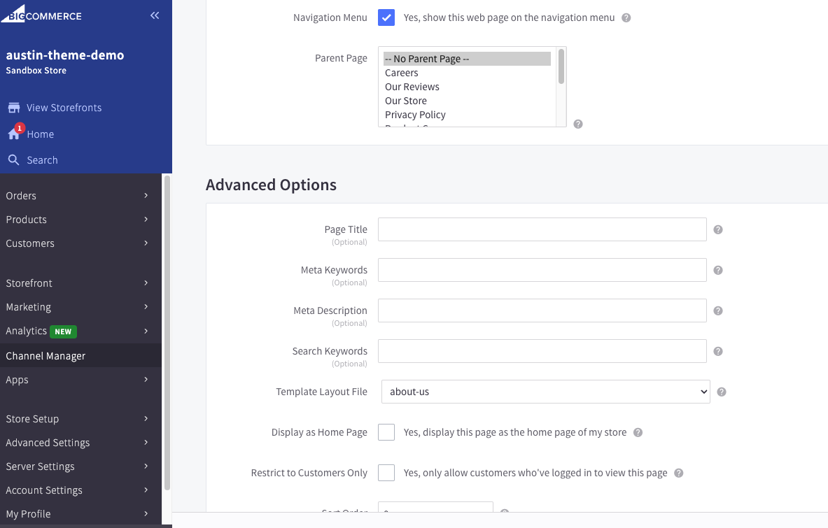
About Us Page
The Austin theme comes with a special template for your company page in order to help it stand out a little against your other content pages. In order to set this up, you must edit your About page to use the 'about-us' template in the page admin, as shown below:
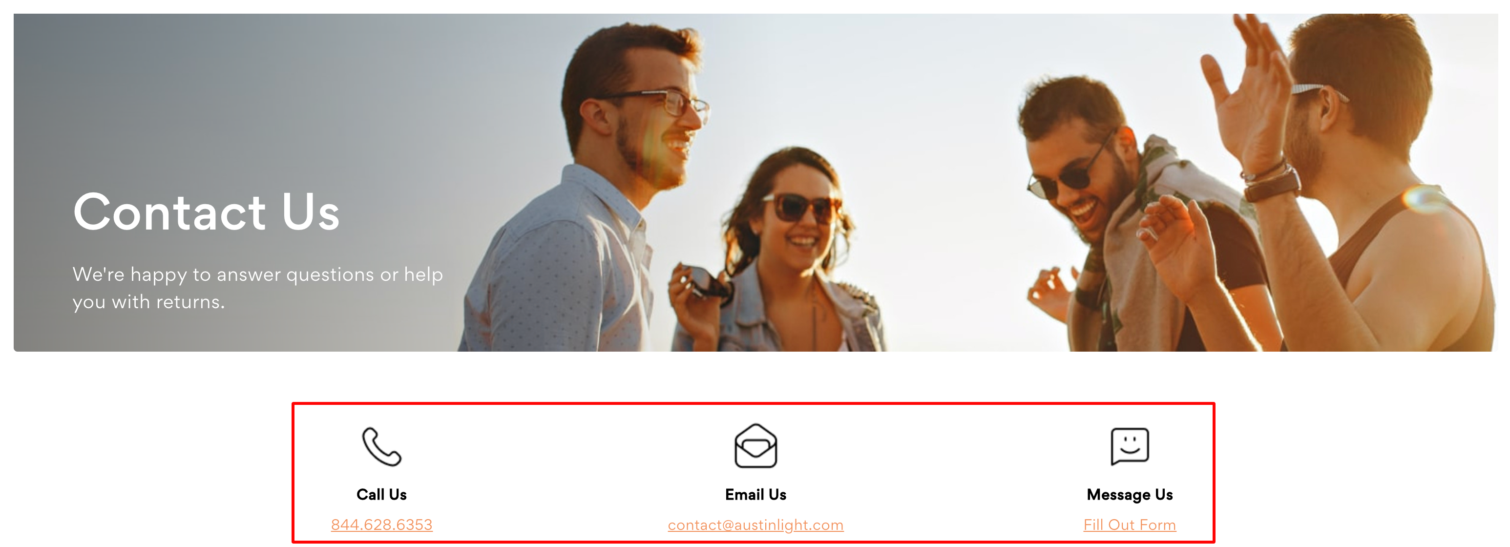
Contact Us Page
This template is automatically applied to any page that is set with the option of 'Allow people to send questions/comments via a contact form.' All images and verbiage (not including the form fields) can be edited via the theme editor.
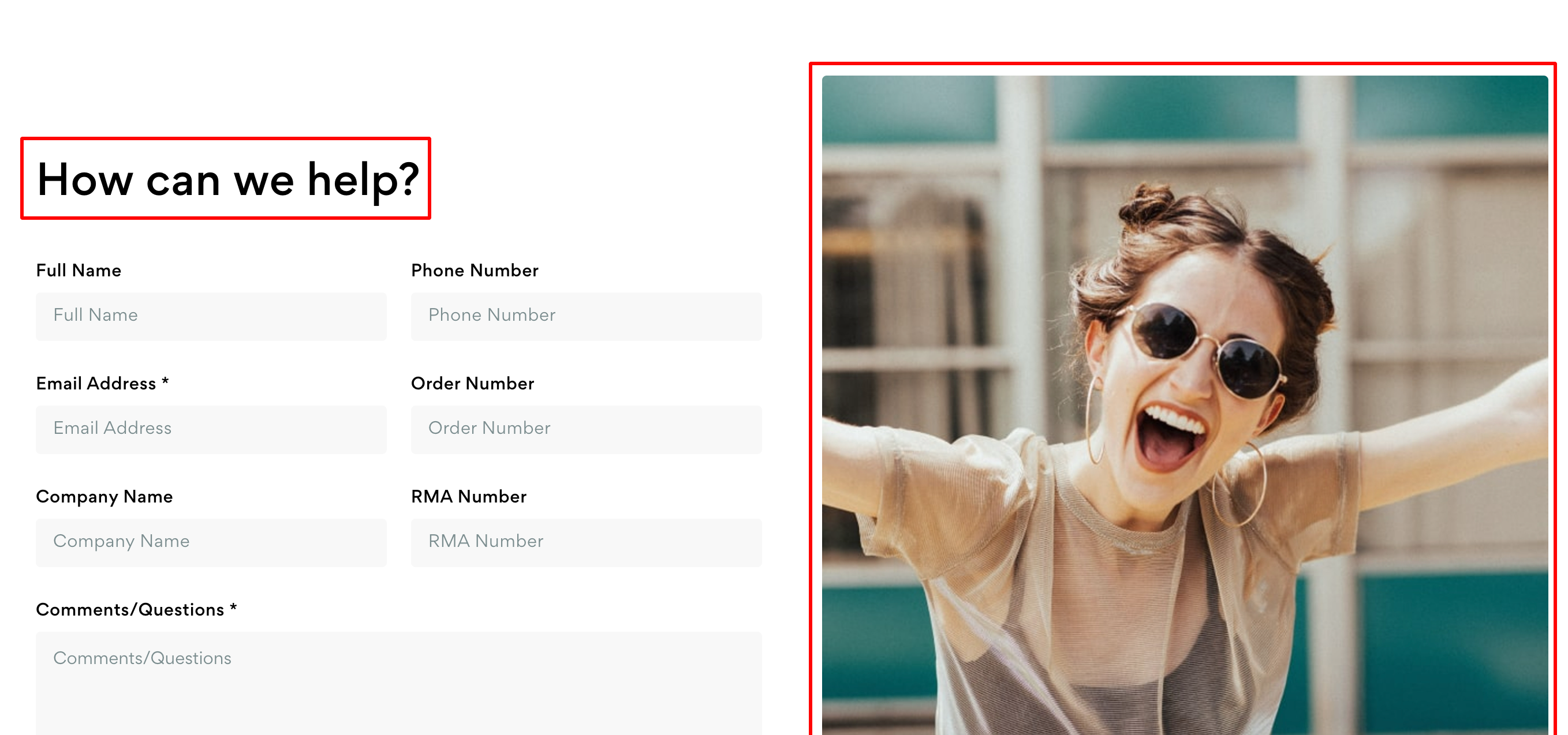


Recommended Image Sizes: (Tall) 650x850 pixels; (Icons) 55x55 pixels.
Release Notes
v1.4.2
- Updated theme images for page builder preview and marketplace.
v1.4.1
- Reset price to $295.00
v1.4.0
- Added theme options for product comparison thumbnails
- Re-added product compare feature with floating selections bar
- Social share menus are now dropdowns that can be toggled open/closed
- Improved styles for image column on product page for tablet
- Added fluid typography settings to main navigation on desktop
- Updated to Cornerstone 6.10.0
v1.3.10
- Light/Night Variants: Product page image gallery opens with image that was clicked, not the first image in the series.
v1.3.9
- Changed theme price to $75.00
v1.3.8
- Added a visibility toggle for the short meta description under the title on the product page
- Added settings for Blog url/title customization for navigation purposes (header/footer)
- Main slideshow now has full link when button is hidden
- Main slideshow fades in on load to prevent page jumping from javascript load
- Resolved image cropping issues on theme variants
- Credit card fields readability improvement for checkout
- Fixed vertical alignment of Shipping / Gift Options fields on product page
- Product page Downloads title variable added to lang file
- Fixed image ratios in thumbnail carousel on product page
- Theme Node 18 compatible
- Removed Apollo package dependency from custom scripts
v1.3.7
- Added schema settings for contact page icon section
- Added ability to control product title size
- Added page builder regions to About template and additional regions to base page template
- Added ability to toggle the wishlist button on and off for the product page
- Added ability to use custom background images for navigation dropdown, home newsletter, and footer on Night variant
- Fixed email field button alignment with new checkout settings
- Fixed newsletter widget font colors to match theme settings selection
- Reassigned ID for home page promo section button link to correct value
- Fixed alignment of image carousel dots on product page for tablet
- Cart preview layout improved on tablet
- Product page image column layout improved on tablet
- Updated language files to match the most recent Cornerstone version
- Added 'Shop All' link to subcategories on mobile navigation
v1.3.6
- Style improvements for account addresses page
- Fixed bug where filters would disappear on brand pages after selecting an item
- Fixed bug where filter sections would not toggle open/closed
v1.3.5
- Revised mobile home page spacing and text layout styles
- Revised mobile content page spacing and text layout styles
- Product page image slideshow now displays variant images properly when options are selected
v1.3.4
- Added store hours in footer to theme settings
v1.3.3
- Fixed title font on home slideshow for Vogue variant
- Fixed duplicate Add to Cart action when Google Analytics 4 is active
- Fixed Page Builder server error on Night variant when adding pages that have subpages to the main navigation
- Fixed subpage dropdown behavior where multiple megamenu instances would open at the same time
v1.3.2
- Resolved syntax issue in en.json file that was causing a Server Error when attempting to load the theme in Page Builder
v1.3.1
- Added mega menu background color to theme settings.
- Added footer newsletter visibility to theme settings.
- Fixed variable for adding category description to the banner image.
- Restored missing footer column settings to theme schema.
- Resolved product page carousel dot styles and page builder issues
- Various minor style improvements and fixes.
- Added new hidden image fallback for banners with 404 images.
v1.3.0
- Added ability to control visibility and aspect ratio of subcategory thumbnails on category pages
- All homepage content images and text management has been moved from the en.json file and can now be managed via theme settings and default widgets within page builder
- Fixed font rendering issues within page builder and on customized versions of theme
- Fixed image references for background elements in Night variant
- Product page will now always display the product price on a separate line, rather than being paired alongside the product name; this helps with styles when third-party payment plugins are installed on a store
- Rearranged default contact form fields so that related fields are paired together properly
v1.2.2
- Removed oBundle phone number from header dev tag
- Updated product schema to match most recent version of Cornerstone
v1.2.1
- Added general custom fields back to product page
- Product card image aspect ratio can now be changed in theme settings
- Updated theme settings for site alert message colors
- Hide button on home page carousel if text box is empty
- Reduce category title height when there is no banner image present
- Fixed layout of alert boxes that have multiple messages
v1.2.0
- Email and phone number on contact page template now pull directly from store profile settings
- Footer redesign - removed additional logo space and condensed navigation layout
- Homepage newsletter text and footer newsletter text now include dynamic store name from profile settings
- Added ability to show/hide subcategory carousel overall. Can now also set a minimum number of subcategories required before carousel will display
- Title gradient banner is now on by default for all variants
- Added ability to show/hide both the Learn and Support columns in the footer navigation
- Eliminated duplicate breadcrumbs on content pages
- HTML encoding now renders properly on account creation message
- Fixed product filter button toggle on search page
- Pages in mega menu now show child page dropdowns
- Resolved issues with displaying product reviews on the Quick View modal
- Fixed issue where only one product could be removed at a time from the cart dropdown preview
- Checkout ADA styles match theme
- Reduced size of consent manager buttons on Vogue
- Improved product layout on Quick Search for mobile devices
- Improved appearance of page builder widget icons across theme
- Updated default image carousel widget styles to better match theme
- Improved styles for checkout error modals
- Improved styles for credit card input fields on checkout
v1.1.3
- Resolved bug where cart preview would not close after removing a product.
- Boosted checkout experience by adding a 'Continue' button to the 'Checkout as Guest' form
v1.1.2
- Added ability to toggle address in footer
- Added ability to toggle the gradient overlay for category and page banners
- Fixed text and styles on modal confirmation buttons
- Fixed shipping estimator toggle box
- Fixed product image carousel on mobile. Improved layout when no video is present in Vogue variation.
- Fixed product page select field heights on mobile
- Fixed mobile dropdown submenus on various page templates
- Improved visibility of various svg icons in the checkout across all variants
v1.1.1
- Fixed syntax issue in en.json file that was causing Page Builder to throw a 500 error
v1.1.0
- Updated Cornerstone base to version 6.5.0
- Created setting for showing/hiding oBundle logo in footer
- Added ability to toggle View Brands link in Shop column in footer
- Added option to change or remove product image filter effects
- Added option to toggle the product price onto a new line on product pages to accommodate for dynamic pricing plugins
- Added navigation text color options to page builder
- Fixed header promo tabs on Vogue variant when longer text is used
- Hide brand row in product listing if brand is empty
- Revisited solution for brands and categories that do not have assigned title banner images
- Fixed related products carousel on product page, and suggested products on 404 page
- Added review_title text attribute to en.json
- Make Vogue the default theme, instead of Light
- Update remaining social icons
- Update payment icons
- Update price to $295
v1.0.3
- Changed product card images to use aspect ratio for sizing
- Resolved all CTA and blog card image sizes as aspect ratio instead of fixed height
- Fix currency selector spacing issues in header
- Remove currency selector component from mobile header
- Add mobile currency selector component to mobile nav menu
- Tweak currency selector styles
- Replace info@ with support@ email references
- Updated dev signature
v1.0.2
- Added currency selector to header for mobile devices
- Fixed currency dropdown colors for desktop (match header colors)
- Fixed settings control for product colors - inputs and options
- Replaced envelope icon for checkout on Night variant
- Changed active shipping and payment options to theme colors
- Focused form elements now keep same styles as normal form elements (separate outline styles still remain for ADA compliance)